
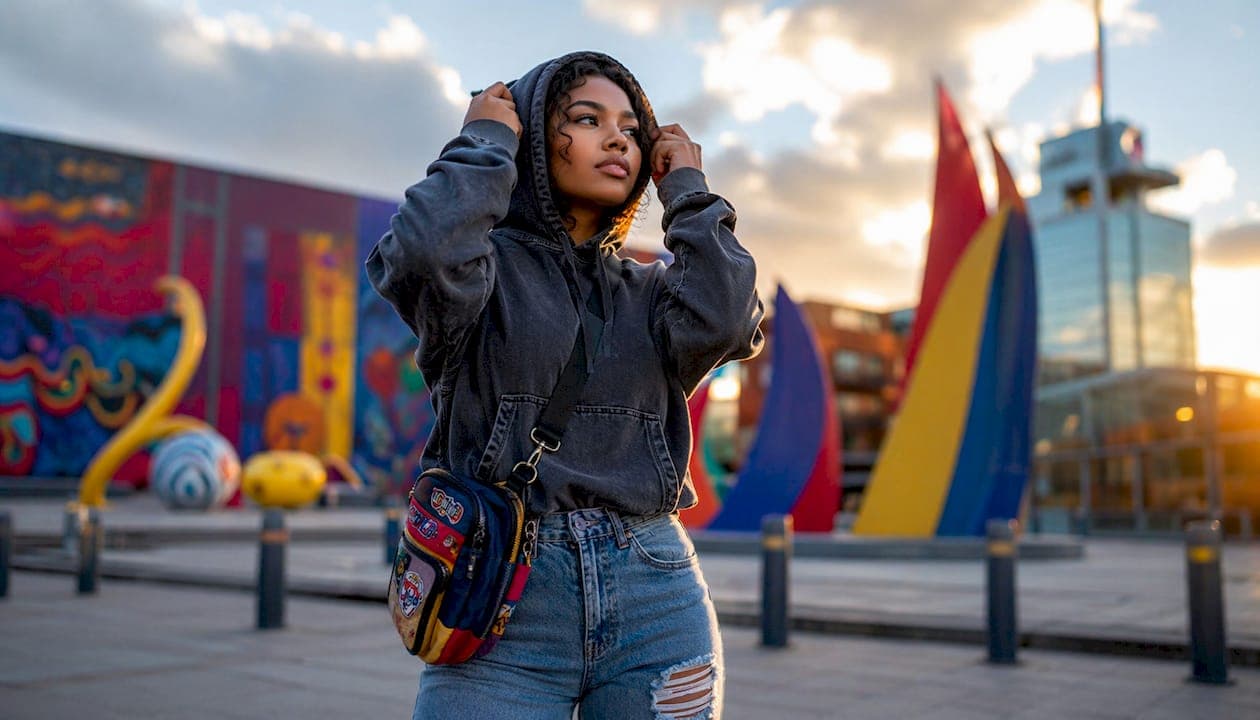
Worn graphics in street style are the primary visual language of urban fashion, communicating identity, cultural affiliation, and personal history before a single word is spoken. The term "worn graphics" describes the broader industry practice of distressed, aged, or vintage-inspired print design, what apparel insiders call "graphic storytelling through fabricated patina." Graphics in streetwear function as symbolic communication tools, signaling subcultural belonging, political positions, and lived experience. Native303apparel builds its entire design philosophy on this principle, rooting every print in the real cultural memory of metro Denver. Understanding the role of worn graphics in street style means understanding why the garment is never just a garment.
How do worn graphics define identity in street style?
Graphics are not decoration. Graphics are the core product in streetwear, with the garment itself serving as a vehicle for visual communication. That distinction matters because it changes how you read a piece of clothing. A faded concert tee from a defunct Denver club says something a plain crewneck never could.
Urban graphics fashion works because specific references carry weight. A graphic tied to a real neighborhood, a closed record shop, or a local sports moment creates instant recognition among people who share that history. That recognition is the point. It separates insiders from outsiders without a single word.
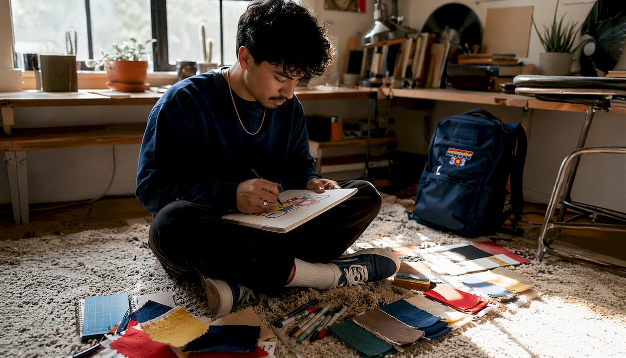
Local cultural references do something else, too. They build community. When two people on a Denver street recognize the same graphic, they share a moment of mutual belonging. That is the social function of worn graphics trends at their most direct. It is also why generic, mass-produced prints feel hollow by comparison.
The most effective street style graphic tees reference specific, plausible cultural moments rather than vague nostalgia. A graphic that nods to a real place or era carries credibility. A graphic that just looks "old" carries none. The difference between the two is the difference between a badge and a costume.
Key cultural signals worn graphics carry include:
- Subcultural affiliation: Music scenes, skate culture, and local sports communities all have distinct visual codes.
- Geographic identity: City-specific references, neighborhood names, and local landmarks anchor a graphic to a real place.
- Era markers: Typography, color palettes, and illustration styles that reference specific decades signal aesthetic literacy.
- Political and social positions: Graphics have carried protest messages and countercultural statements since the 1960s.
- Personal narrative: A graphic tied to a personal memory or local experience functions as wearable autobiography.
What technical methods create authentic worn graphics?
Discharge printing chemically removes fabric dye in the graphic area and replaces it with print color embedded directly in the fibers. The result is a soft, breathable graphic that fades naturally with washing and wear. That natural fade is exactly what separates a credible worn graphic from the stiff, plastic-looking prints common in lower-quality garments.
Water-based inks work on a similar principle. They absorb into the fabric rather than sitting on top of it. The graphic becomes part of the shirt, not a layer applied to it. Over time, the print softens and ages in a way that feels earned rather than manufactured.
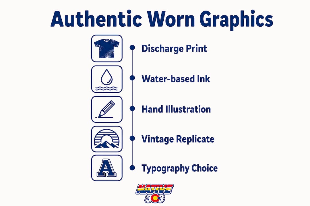
Hand-drawn illustration is the other major technique driving authentic worn aesthetics. Deliberately unprofessional design elements like raw edges, visible sketch lines, and irregular letterforms signal that a human made this. That signal matters to streetwear enthusiasts who have grown skeptical of computer-perfect commercial graphics.
Pro Tip: When evaluating a graphic tee's authenticity, press the print flat with your palm. A quality discharge or water-based print will feel like the fabric itself. A plasticky, raised surface means screen-printed plastisol ink, which cracks and peels rather than aging gracefully.
The methods that produce the most believable worn effects include:
- Discharge printing: Removes base dye and replaces it with embedded color for a soft, naturally fading result.
- Water-based inks: Absorb into fabric fibers rather than coating the surface, producing a breathable, lived-in feel.
- Hand-drawn illustration: Introduces deliberate imperfection that reads as human and authentic.
- Halftone degradation: Intentionally broken dot patterns mimic the look of aged offset printing.
- Selective distressing: Fading concentrated at collar, cuffs, and graphic edges mirrors real wear patterns rather than random bleaching.
How have vintage prints shaped modern streetwear trends?
Consumer value of vintage products is driven by three dimensions: moderate age, iconicity, and scarcity. Together, these factors create personal, social, and sustainability appeal. That three-part framework explains why a graphic referencing a 1994 Denver rave carries more weight than one referencing last year's pop-up.
The impact of vintage prints on modern streetwear is measurable. Since 2020, vintage-inspired reproductions have outpaced generic prints in both search volume and sale price. Consumers are paying more for graphics that feel historically grounded. That is a direct market signal about what people actually want from their clothing.
Print sales worldwide have more than doubled over the last decade as of january 2026. That growth reflects a broad consumer appetite for artistic and historically resonant imagery, not just in fine art but across apparel and everyday objects.
Digital technology has made it possible to replicate vintage print imperfections with precision. Brands now reproduce faded ink and worn edges digitally to sell a continuity story with the garment. The best executions pair those digital techniques with the physical printing methods described above, so the graphic ages convincingly after purchase.
| Vintage graphic element | What it signals | Modern application |
|---|---|---|
| Faded color saturation | Age and authentic use | Discharge printing with intentional ink reduction |
| Cracked or broken linework | Physical wear over time | Halftone degradation and selective distressing |
| Period-specific typography | Era and subcultural literacy | Hand-set or hand-drawn lettering styles |
| Iconicity of subject matter | Cultural significance | References to real local events, venues, or figures |
| Scarcity of original | Collector and community value | Limited runs and location-specific designs |
The revival of vintage prints in modern fashion is driven by consumer desire for authenticity, sustainability, and connection to design history. Trend chasing alone does not explain it. People want clothing that carries a story they can believe in.
What graphic trends define streetwear culture in 2026?
Two opposing aesthetics dominate streetwear graphics right now. Y2K maximalism pushes oversized, high-contrast prints with layered imagery and digital glitch effects. On the other end, zine-inspired hand-drawn graphics favor restraint, raw texture, and visible process. Both reject the clean, corporate polish of mainstream retail graphics.
Brutalist and intentionally unprofessional graphics have become a cultural statement in their own right. Misregistered prints, visible crop marks, and unfinished-looking compositions communicate that the wearer understands design well enough to break its rules deliberately. That is an advanced form of aesthetic literacy, and streetwear communities recognize it immediately.
Typography carries particular weight in 2026 worn graphics trends. The choice between a distressed serif, a hand-stamped gothic, and a degraded sans-serif communicates entirely different subcultural affiliations. Type is not just text on a shirt. It is a signal about what scenes you have moved through and what aesthetics you respect.
Pro Tip: If you want a graphic tee that ages well visually and culturally, prioritize designs with specific local references over generic retro imagery. A shirt referencing a real Denver venue from the 1990s will still carry meaning in ten years. A shirt that just looks "vintage" will look dated instead.
The dominant graphic directions shaping streetwear in 2026 include:
- Y2K maximalism: Dense, layered compositions with digital artifacts and high-contrast color.
- Zine aesthetics: Hand-drawn, photocopied-looking graphics with visible texture and deliberate roughness.
- Brutalist typography: Oversized, misaligned, or intentionally broken letterforms as the primary graphic element.
- Archival revival: Direct references to real historical moments, venues, and cultural figures from specific cities and eras.
- Sustainability signaling: Graphics that reference craft, longevity, and anti-fast-fashion values through their visual language.
How graphics define streetwear in this moment comes down to one principle: specificity beats generality every time. The more precisely a graphic references a real cultural moment, the more it resonates with the people who lived it and the more it intrigues the people who did not.
Key Takeaways
Worn graphics work because they carry specific, believable cultural stories, and the technical methods used to produce them determine whether those stories age with credibility or fall apart in the wash.
| Point | Details |
|---|---|
| Graphics are the core product | In streetwear, the garment carries the graphic, not the other way around. |
| Specificity drives authenticity | Graphics referencing real local moments carry more cultural weight than generic vintage aesthetics. |
| Printing method determines longevity | Discharge printing and water-based inks produce graphics that age naturally rather than crack or peel. |
| Vintage value has three drivers | Moderate age, iconicity, and scarcity together define why worn graphics resonate commercially and culturally. |
| 2026 trends reward aesthetic literacy | Brutalist, zine-inspired, and archival graphics signal cultural knowledge, not just style preference. |
Why specificity is the only thing that matters in worn graphics
Most articles about worn graphics spend their time on aesthetics. I want to talk about the thing underneath the aesthetics: plausibility.
A worn graphic either tells a story you can believe or it does not. The technical execution matters, and the printing method matters, but neither saves a graphic that references nothing real. I have seen beautifully distressed shirts that felt completely empty because the imagery was invented nostalgia with no anchor. And I have seen rough, imperfect prints on basic blanks that stopped people on the street because the reference was so specific and so right.
The most authentic worn graphics draw on specific, plausible cultural references, like a defunct local brand or a real event, rather than generic fading. That is the standard I apply when I look at any graphic tee. Not "does this look old?" but "does this reference something that actually happened?"
Native303apparel gets this right in a way that most brands do not. The designs are rooted in the actual memory of metro Denver, real eateries, real clubs, real shops. That specificity is not a marketing angle. It is the design philosophy. When you wear a shirt that references a place you actually went, or a place your parents talked about, the graphic does something no amount of distressing technique can manufacture on its own.
The practical takeaway for you as a streetwear enthusiast is this: before you buy a graphic tee, ask what the graphic is actually referencing. If the answer is "nothing specific," the shirt will feel like a costume within a season. If the answer is a real place, a real moment, or a real community, you have something worth wearing for years. You can learn more about spotting genuine designs before you commit to a purchase.
— Rob
Native303apparel: where Denver's memory lives in every graphic
Native303apparel was built on the exact principle this article describes. Every design in the collection references a real piece of metro Denver's cultural history, from the iconic eateries that defined neighborhoods to the clubs and shops that shaped the city's identity across decades.
The brand uses printing methods that produce graphics with genuine depth and longevity. These are not shirts that look worn on the rack and fall apart after ten washes. They are pieces designed to age the way real cultural artifacts do, getting better and more specific as time passes. If you are looking for street style graphic tees that carry actual stories rather than manufactured nostalgia, the Native303apparel collection is worth your time. Each piece connects you to a real place and a real moment in Denver's history.
FAQ
What are worn graphics in streetwear?
Worn graphics are distressed, aged, or vintage-inspired print designs that use fabricated patina to communicate cultural authenticity. They are the primary visual language of street style, signaling identity and subcultural affiliation before any other garment feature registers.
Why do vintage-inspired graphics cost more than standard prints?
Vintage-inspired reproductions outpace generic prints in sale price because consumers pay for the three dimensions of vintage value: moderate age, iconicity, and scarcity. Graphics that reference real cultural moments carry higher perceived and commercial value.
What printing method produces the most authentic worn effect?
Discharge printing produces the most authentic worn effect by chemically embedding color directly into fabric fibers. The result fades naturally with wear rather than cracking or peeling like surface-applied plastisol ink.
How do I tell if a worn graphic is culturally authentic or just decorative?
Authentic worn graphics reference specific, plausible cultural moments, real venues, events, or communities, rather than generic vintage imagery. If a graphic cannot answer the question "what is this actually referencing?" it is decorative rather than culturally grounded.
What graphic styles define streetwear in 2026?
The dominant styles in 2026 are Y2K maximalism, zine-inspired hand-drawn aesthetics, brutalist typography, and archival revival graphics tied to specific cities and eras. All four reward aesthetic literacy over generic trend following.