
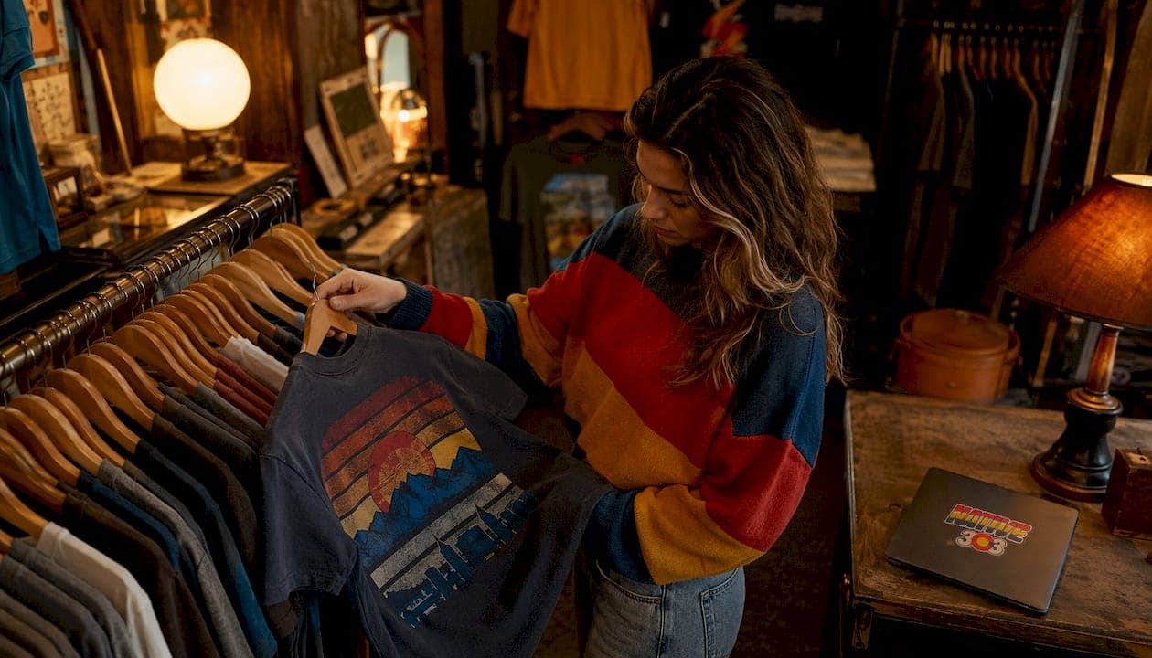
Era-specific graphics turn clothing into emotional place-keepers that signal local identity and drive purchase through nostalgia and authenticity cues. Before you read another word, here is the short version:
- Emotional anchoring: Period-accurate visuals trigger memory and comfort, making a garment feel personally meaningful rather than mass-produced.
- Authenticity signaling: Local motifs, aging techniques, and era-accurate palettes communicate that a design was researched, not just styled.
- Modern relevance: The strongest retro pieces blend vintage graphic elements with contemporary cuts and fabrics, keeping the look wearable rather than costume-like.
Native303apparel builds every collection around these three mechanisms, drawing on metro Denver's mid-century diners, 1970s outdoor culture, and 1990s garage-rock scene. Design resources like Envato Tuts+ and AP News retro coverage confirm this approach is driving a broad revival across fashion and lifestyle categories.
Table of Contents
- Why nostalgia makes era-specific graphics so effective
- How graphics in clothing shifted from documentary to cultural tools
- What design techniques actually separate thoughtful retro from lazy throwbacks
- How to style era-specific graphics in a Denver-inspired wardrobe
- How Native303apparel applies these tactics to Denver nostalgia
- What to check before buying nostalgia-driven, era-specific apparel
- Key Takeaways
- Why local graphics carry more weight than people realize
- Native303apparel brings Denver's vintage culture to your wardrobe
- Useful sources and further reading
Why nostalgia makes era-specific graphics so effective
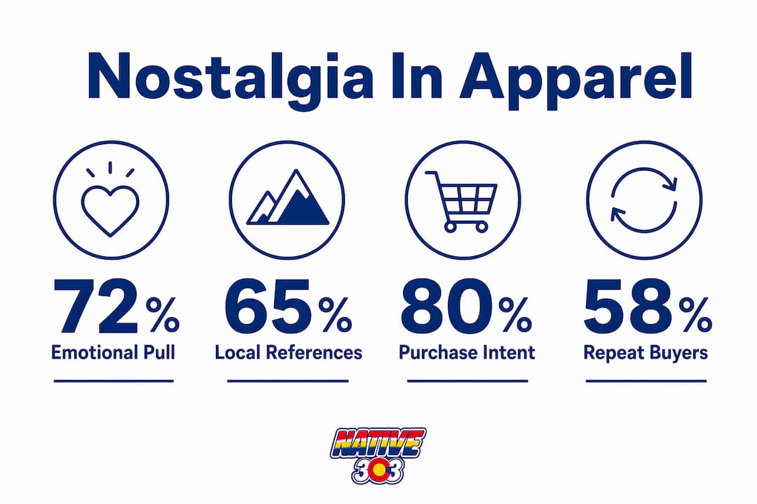
Vintage graphics work as peripheral cues. That means they bypass deliberate evaluation and influence how a shopper feels about a product before they consciously analyze it. When the visual language feels culturally consistent, trust and purchase intent both rise.
A peer-reviewed experiment with 189 participants found that retro design significantly increased perceived environmental friendliness and purchase intention for recycled products. The mechanism is the same for lifestyle apparel: the graphic does persuasion work the product description never could.
Stat to know: In that n=189 study, retro styling alone shifted both trust perception and purchase intent, without any change to the product itself.
For Denver shoppers, this means a tee referencing a beloved closed diner carries more emotional weight than a generic "vintage" label. The local specificity is the cue.
| Source | Sample | Key finding |
|---|---|---|
| Asia Pacific Journal of Marketing and Logistics (2024) | n=189 online experiment | Retro design raised perceived friendliness and purchase intention |
| MDPI Sustainability (2020) | Qualitative interviews | Neo-retro cues evoke durability and craftsmanship associations |
| AP News retro revival report | Observational/editorial | Cross-generational appeal from Gen X through Gen Z confirmed |
Pro Tip: When you pick up a retro piece, look for at least two locally specific cues, a place name, a recognizable color scheme, or a motif tied to a real Denver institution. Generic "distressed" without a story is styling, not nostalgia.
How graphics in clothing shifted from documentary to cultural tools
Graphics started as documentary records and evolved into interpretive design tools that construct brand identity and collective memory. Fashion illustration began in the 16th century as a way to report what people actually wore, functioning more like journalism than art.
Key shifts in that evolution:
- Fashion plates (18th–19th century): Hand-colored engravings in journals like La Belle Assemblée documented silhouettes and fabrics with near-technical precision.
- Illustrated advertising (early 20th century): Graphics moved from reporting to persuasion, using stylized figures to sell aspiration alongside garments.
- Mass printing and halftone textures (mid-20th century): Screen printing made graphic tees viable for the masses; halftone dots became a visual shorthand for the era.
- Retro revival (1980s onward): Designers began mining earlier decades deliberately, using period motifs as emotional shorthand rather than literal reproduction.
For Denver specifically, three eras get recycled most often. Mid-century diner signage, with its bold block lettering and two-tone color fields, references a time when Colfax Avenue was a destination. The 1970s outdoor recreation graphics, think stylized mountain silhouettes and earthy ochre palettes, tap Colorado's identity as a place people came to escape. The 1990s grunge and garage-rock aesthetic, with its photocopied zine energy, speaks to a younger Denver that felt genuinely underground. Collectors hunting Denver retro graphic tee themes will recognize all three immediately.
What design techniques actually separate thoughtful retro from lazy throwbacks
Effective retro design blends period-accurate motifs with contemporary execution. The palette, the type, the texture, and the placement all have to agree on the same decade, or the graphic reads as costume rather than culture.
Core tactics designers use:
- Era-accurate color palettes: Muted earth tones for 1970s pieces; saturated primaries for 1980s work; washed-out, low-contrast tones for 1990s grunge.
- Typographic choices: Slab serifs and hand-lettered scripts for mid-century; chunky condensed sans-serifs for 1980s sports graphics.
- Halftone and grain textures: Applied as overlays, these signal authenticity when used deliberately, not just slapped on for effect.
- Distressed and simulated-age printing: Cracked ink edges and faded color fields communicate that a design has a history, even when it is brand new.
- Scale and placement shifts: Oversized chest graphics or off-center placements feel contemporary while the motif stays period-accurate.
- Vintage motif plus modern minimalism: Pairing a dense retro illustration with a clean, uncluttered garment keeps the piece wearable for streetwear contexts. AP News notes that blending vintage with contemporary details is the defining move of the current revival.
| Technique | What it signals to buyers | Visual cue to look for |
|---|---|---|
| Halftone overlay | Deliberate research, print-era authenticity | Dot pattern visible under main image |
| Distressed ink edges | Age and wear, craftsmanship | Cracked or faded color at graphic borders |
| Era-accurate palette | Period specificity, not generic "vintage" | Color choices match a recognizable decade |
| Hand-lettered type | Local or artisan origin | Slight irregularities in letterforms |
| Oversized placement | Modern sensibility fused with retro content | Graphic extends past chest-center |
Pro Tip: Ask any seller: "What local reference or historical source inspired this graphic?" A designer who researched the piece will answer immediately and specifically. Vague answers like "just a vintage vibe" tell you everything you need to know.
How to style era-specific graphics in a Denver-inspired wardrobe
The goal is to balance the retro graphic with modern fits and local cues so outfits stay wearable year-round, not just on Halloween. Denver's altitude and variable weather actually make layering a natural fit for this aesthetic. For more pairing ideas, the vintage tee styling guide covers the fundamentals well.
Practical pairing rules:
- Retro graphic tee plus straight-leg or wide-leg contemporary denim keeps the silhouette current while the graphic does the talking.
- A technical mid-layer, a fleece or a light insulated vest, complements earthy 1970s palettes without clashing.
- Avoid pairing a busy retro graphic with another patterned piece; let the tee be the focal point.
- For spring and fall altitude swings, an unstructured overshirt in a neutral tone layers over the graphic without covering it entirely.
Streetwear positioning for Denver contexts also matters. Creative professionals navigating streetwear aesthetics often anchor a look with one statement piece and keep everything else understated.
Three quick outfit frameworks:
- Coffee-run look: Retro diner tee, slim chinos, white low-top sneakers. The graphic carries the personality; everything else stays clean.
- Weekend trail-town look: 1970s mountain-motif tee, technical joggers, trail runners. The earthy palette bridges outdoor function and streetwear.
- Night-out layering: 1990s garage-rock tee under an open flannel or structured bomber, dark jeans, Chelsea boots. The layering adds formality without losing the retro energy.
How Native303apparel applies these tactics to Denver nostalgia
Native303apparel applies era-specific graphic tactics directly to metro Denver identity through color, motifs, and aging techniques that reference real places and real decades. The brand's local storytelling approach treats each design as a piece of neighborhood history, not just a style choice.
Brand profile highlights:
- Signature palette: Vibrant red, yellow, and blue stripes drawn from Colorado's mountain culture and vintage Americana, combined with a playful retro sensibility.
- Core motifs: Metro Denver's iconic eateries, clubs, and classic shops, translated into graphic elements that carry recognizable local references.
- Design approach: Clean geometric forms paired with period-accurate aging techniques, so pieces feel contemporary and historically grounded at the same time.
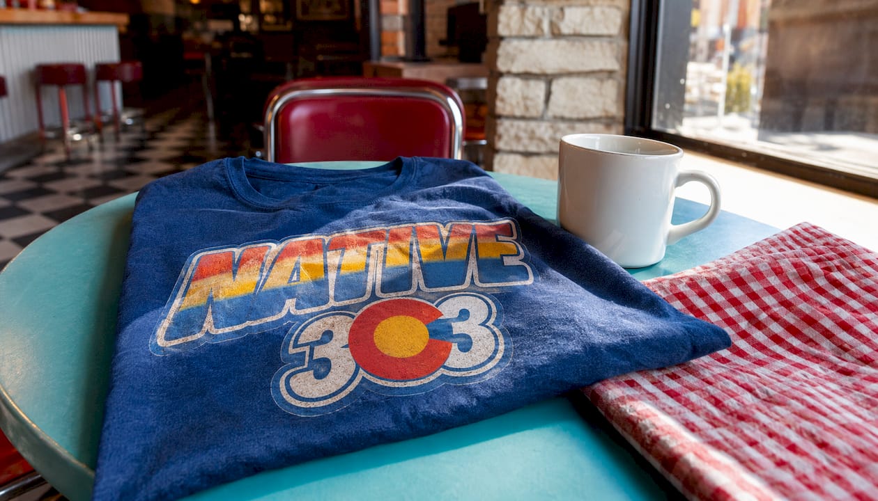
Two concrete design examples illustrate the method. A mid-century diner-inspired tee uses bold block lettering, a two-tone color field, and a slightly distressed ink edge to evoke Colfax Avenue's postwar heyday. A 1970s outdoor recreation piece uses a stylized mountain silhouette in ochre and burnt sienna, with a halftone texture overlay that reads as a screen-printed relic from Colorado's ski-boom years.
Rob, who covers streetwear and layering in depth across the Native303apparel blog, notes that the worn graphics tradition in street style is what separates a piece with cultural weight from one that just looks old.
What to check before buying nostalgia-driven, era-specific apparel
Prioritize provenance, print method, fabric, and story when choosing era-specific pieces. A garment that checks all four is worth the price; one that checks none is fast fashion with a filter applied.
Checklist:
- Print technique: Screen printing or discharge printing signals quality; heat-transfer vinyl on a retro graphic is a red flag.
- Fiber content: 100% cotton or a cotton-polyester blend with a broken-in feel holds distressed graphics better than synthetic-heavy fabrics.
- Story provenance: Can the brand or seller name the specific local reference? Genuine Denver-inspired designs always have a traceable source.
- Limited runs or numbering: Small production runs suggest intentional design rather than mass reproduction.
- Local references: Specific street names, venue names, or neighborhood motifs beat generic "Colorado" or "vintage" labels every time.
Red flags: generic "vintage" labels with no backstory, poor print resolution where halftone dots look pixelated rather than deliberate, mismatched era elements (a 1970s palette with 1990s typography), and suspiciously cheap "distressed" pieces that feel machine-worn rather than thoughtfully aged.
On sustainability: local reproductions produced in small runs generate less waste than fast-fashion retro, and neo-retro design that emphasizes durability cues actually increases consumer acceptance of reused or refurbished products. Buying locally inspired pieces from brands with a clear design story is the more sustainable choice by default.
Pro Tip: Ask: "Is this a limited run, and how many were made?" A brand that tracks production numbers takes the design seriously. One that cannot answer probably does not.
Key Takeaways
Era-specific graphics work because they function as emotional anchors, not just decoration, and the most effective ones combine period-accurate research with modern wearability.
| Point | Details |
|---|---|
| Nostalgia as a purchase driver | Retro visual cues shift trust and purchase intent before shoppers consciously evaluate a product. |
| Authenticity requires specificity | Local motifs, traceable references, and era-accurate palettes separate genuine retro from generic "vintage." |
| Layering makes retro wearable | Pairing a graphic tee with contemporary fits and neutral technical layers keeps the look current, not costume-like. |
| Buying checklist matters | Check print technique, fiber content, story provenance, and local references before purchasing. |
| Native303apparel as a local resource | Native303apparel designs around Denver-specific motifs and aging techniques for shoppers seeking authentic local pieces. |
Why local graphics carry more weight than people realize
Most conversations about retro apparel focus on aesthetics: the palette, the type, the texture. What gets underestimated is the geographic specificity. A graphic that references a real Denver institution, a diner that closed in 1987, a club that defined a neighborhood for a decade, carries a kind of emotional proof that no amount of distressing technique can fake.
The research on peripheral cues confirms this. Shoppers do not consciously audit a graphic for historical accuracy, but they sense when something feels earned versus assembled. That feeling is what drives repeat purchases and word-of-mouth. Generic retro styling can look the part; locally grounded design actually plays it.
The practical implication for anyone building a Denver-inspired wardrobe: prioritize brands that can tell you exactly where a design came from. The story is not marketing. It is the product.
Native303apparel brings Denver's vintage culture to your wardrobe
If you have been looking for pieces that actually reference Denver's history rather than a generic retro aesthetic, Native303apparel is built for exactly that. Every design draws from metro Denver's iconic eateries, clubs, and classic shops, translated into graphic tees that carry a real local story.
The collection uses era-accurate palettes, screen-printed aging techniques, and Colorado-specific motifs to give each piece the kind of specificity this article describes. Browse the full Denver-inspired collection to find pieces tied to the neighborhoods and decades you actually care about. Not sure about sizing? The size guide covers fit across all styles. Read more about the brand's local design philosophy on the About Native303 page.
Disclosure: Native303apparel is the client brand behind this article.
Useful sources and further reading
- Envato Tuts+: The Return of Vintage Design — Practical design tutorial covering halftone textures, distressed inks, and era-accurate palettes; the best starting point for understanding retro technique.
- AP News: Retro Revival in Home Decor and Tech — Observational reporting on the cross-generational appeal of 1970s–1990s aesthetics and how designers blend vintage with modern details.
- Asia Pacific Journal of Marketing and Logistics (2024) — Peer-reviewed experiment (n=189) demonstrating how retro design functions as a peripheral cue that raises purchase intention.
- MDPI Sustainability: Timeless Design Styles (2020) — Qualitative research on how neo-retro cues signal durability and craftsmanship, supporting the sustainability case for local reproductions.
- Illustration History: Fashion Illustration from the 16th Century to Now — Historical overview of how fashion graphics evolved from documentary records to interpretive cultural tools.
- Native303apparel Blog: Worn Graphics in Street Style — Rob's guide to the craft and cultural weight of worn graphics in Denver streetwear contexts.
- Native303apparel Blog: How Local History Shapes Fashion Identity — Covers how location-based vintage graphics create authenticity and place-based storytelling in apparel design.