
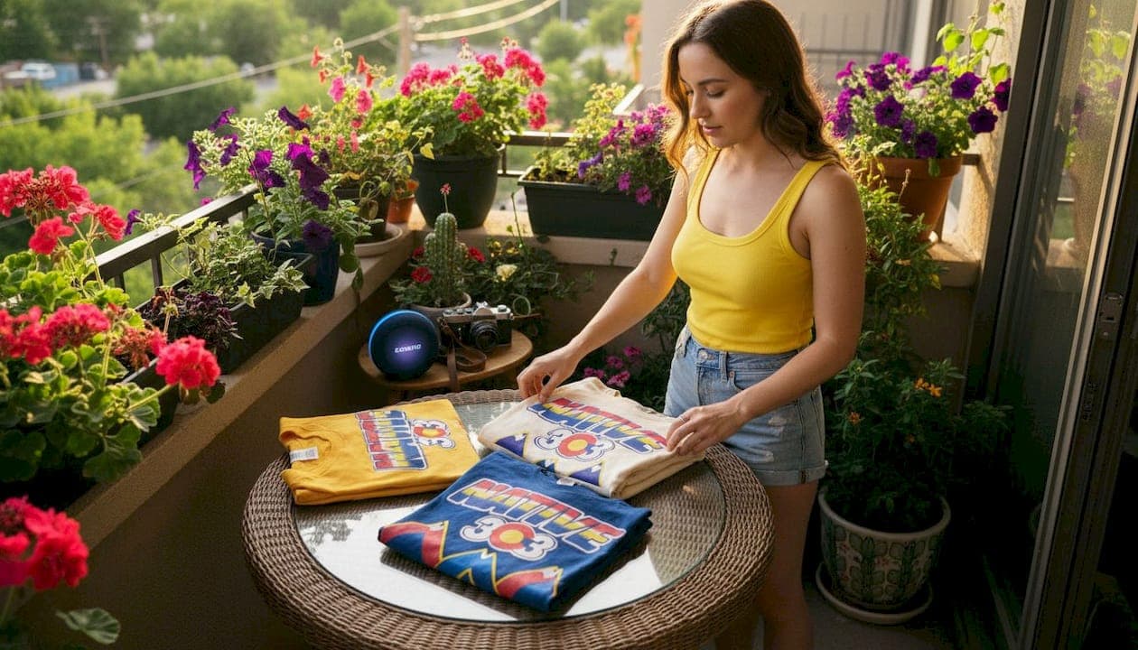
Denver retro graphic tees are defined by five core theme categories: synthwave neon, arcade gaming nostalgia, TV and movie callbacks, sports heritage, and mall-era pop culture. These categories cover the full range of types of Denver retro graphic tee themes that vintage fashion collectors actively seek out. Each theme pulls from a distinct slice of 80s or 90s culture, and each carries its own visual language, color palette, and garment construction style. Knowing the difference between them helps you shop with intention rather than guessing at the rack.
1. Types of Denver retro graphic tee themes: an overview
Retro graphic tee themes fall into four main categories: 80s synthwave neon, arcade gaming nostalgia, TV and movie callbacks, and mall-era pop culture. Denver adds a fifth layer with local sports heritage graphics that connect directly to the city's fan culture. These categories are not just aesthetic labels. They reflect real generational touchstones, and the best designs commit fully to one era rather than blending them into a vague "vintage" look. Collectors who understand these distinctions can spot a well-researched design from across the room.
2. Synthwave and neon retro themes
Synthwave tees use neon gradients, palm-tree silhouettes, and glowing horizon lines drawn from 80s retro-futuristic art. The color palette runs heavy on electric purple, hot pink, cyan, and deep navy. These designs borrow directly from the visual world of early computer graphics, VHS cover art, and the Miami Vice era of television. The result is a shirt that reads as both nostalgic and visually striking.

The appeal of synthwave graphic tee designs goes beyond color. The imagery signals a specific cultural moment: the late 80s belief that the future would look like a neon-lit grid. That optimism is part of what makes these tees resonate with wearers who grew up in that era and with younger collectors who discovered the aesthetic through music and film.
Common design motifs in this category include:
- Gradient sunset skies with horizontal scan lines
- Chrome or metallic lettering in wide, blocky fonts
- Grid-floor perspectives receding to a glowing horizon
- Palm tree silhouettes against a two-tone sky
- Retro-futuristic cityscapes with lens flare effects
Pro Tip: Pair a synthwave tee with straight-leg dark jeans and white low-top sneakers. The clean bottom half lets the graphic do the work without competing for attention.
3. Arcade and gaming nostalgia themes
Arcade-themed tees showcase pixel art drawn directly from NES and SNES-era gaming and 8-bit arcade cabinet design. These shirts appeal most strongly to collectors who grew up feeding quarters into machines at Denver's mall arcades during the late 80s and early 90s. The pixel grid is the defining visual element. Every design element is built from visible, chunky squares that make the retro reference unmistakable.
This category covers a wide range of Denver graphic tee styles. Some designs feature full arcade cabinet artwork reproduced on the chest. Others use a single iconic sprite, a health bar, or a score counter as the central graphic. The color schemes tend toward the limited palettes of actual hardware: four to eight colors maximum, which gives these tees a graphic boldness that more complex designs cannot match.
Key design elements in gaming nostalgia tees include:
- 8-bit and 16-bit pixel art characters and environments
- Arcade cabinet side-art reproductions
- Score counters, lives remaining, and game-over screens
- Limited color palettes that mirror actual hardware constraints
- Bold, pixelated typography from classic game title screens
Pro Tip: When sourcing authentic vintage-style gaming tees, look for designs printed on ring-spun cotton rather than standard jersey. Ring-spun fabric holds fine pixel detail better and softens with each wash, which improves the worn-in look over time.
4. TV, movie, and pop culture callbacks
TV and movie nostalgic tees use Saturday morning cartoon references and sitcom homages printed in VHS-era typography styles. These designs tap into the shared cultural memory of a generation that organized its Saturday mornings around specific cartoon blocks and its Friday nights around TGIF sitcoms. For Denver collectors, these shirts connect to local fan communities that still celebrate those shows at screenings and conventions.
The design language of this category is distinct. VHS-era poster layouts use stacked text, bold drop shadows, and color separations that mimic the printing limitations of the era. A well-executed design in this category looks like it was pulled directly from a video store shelf in 1991.
Four reliable ways to identify authentic vintage-inspired prints in this category:
- Era-accurate typography. Fonts match the actual lettering styles used in the show's original promotional materials, not a generic "retro" font from a modern library.
- Halftone dot patterns. Authentic screen-printed reproductions show visible halftone dots under close inspection, which is a signature of the original printing process.
- Faded color registration. Slight misalignment between color layers signals intentional distressed printing rather than a clean digital reproduction.
- Period-correct color palettes. The colors match what was actually used in the original artwork, not a modernized or saturated version.
Identifying these details separates a thoughtfully produced tee from a generic print-on-demand shirt. Denver's local fan culture rewards that level of attention.
5. Denver sports heritage themes
Denver sports-themed retro tees feature Broncos fan graphics printed on vintage-style tubular knit shirts with distressed prints. The tubular knit construction, which means no side seams, creates a drapey, relaxed fit that modern side-seamed shirts cannot replicate. That silhouette is as much a part of the retro identity as the graphic itself. Materials typically include medium-weight 170gsm cotton with specialized washes for softness and authenticity.
The graphics in this category pull from Denver's sports history with deliberate specificity. Older logo versions, retired uniform colorways, and championship-era imagery all appear in well-researched designs. These are not generic "sports vintage" shirts. They reference specific moments in Denver's athletic history that local fans recognize immediately.
6. Mall-era pop culture themes
Mall-era pop culture tees reference food packaging, mall store branding, and consumer culture from the late 80s and early 90s. This is the most underrated category in Denver vintage t-shirt themes. While synthwave and gaming tees get more attention, mall-era designs carry a specific kind of cultural memory that hits differently for collectors who grew up in Denver's suburban shopping culture.
The design motifs here include fast-food mascots, mall chain store logos, food court packaging graphics, and the bright, primary-color branding that defined retail in that era. Distressed screen printing is the standard technique. It uses specialized methods rather than simply applying a low-resolution image, which produces a genuinely worn look rather than a faded one.
| Feature | Sports heritage tees | Mall-era pop culture tees |
|---|---|---|
| Primary graphic | Team logos, retired uniform art | Store branding, food packaging, mascots |
| Fabric weight | 170gsm medium-weight cotton | Mid-weight cotton, often slub yarn |
| Print technique | Distressed screen print | Distressed screen print |
| Fit style | Tubular knit, no side seams | Tubular or standard, era-dependent |
| Color palette | Team colors, faded and washed | Primary colors, aged and softened |
| Key appeal | Local sports identity | Suburban consumer nostalgia |
Both categories use distressed printing, but the source material is completely different. Sports tees connect to civic pride. Mall-era tees connect to the specific sensory memory of a place that no longer exists.
Key takeaways
Denver retro graphic tees divide into five distinct theme categories, each with its own visual language, fabric construction, and era-specific design logic.
| Point | Details |
|---|---|
| Five core theme categories | Synthwave, gaming nostalgia, TV callbacks, sports heritage, and mall-era culture each require different design approaches. |
| Fabric construction matters | Tubular knit and ring-spun combed cotton deliver the softness and silhouette that define authentic retro tees. |
| Era alignment drives satisfaction | Buyers who match their tee's theme to their own decade of nostalgia report stronger connection to the design. |
| Distressed printing is a skill | Authentic distressed screen-printing techniques use specialized methods, not just low-resolution images. |
| Size up for retro cuts | Vintage tubular cuts run narrower than modern shirts, so sizing up one size produces the correct throwback fit. |
Rob's take on choosing Denver retro tees
The biggest mistake I see vintage shoppers make is buying a theme they think looks cool rather than one that actually connects to their own timeline. A synthwave tee looks great on anyone. But if you were twelve years old in 1993 and your Saturday mornings were built around specific cartoon blocks, a TV callback tee is going to hit you in a way that a neon horizon never will. That personal resonance is what makes a retro tee worth wearing more than once.
The second thing I always check is the fabric. Tubular knit construction is the detail that separates a serious vintage-inspired shirt from a costume. No side seams means the shirt drapes differently on the body. It moves the way shirts actually moved in that era. Pair that with a 20-year wash finish and you have a garment that feels like it has a history before you even put it on.
Sizing is the practical issue nobody talks about enough. Vintage-inspired tees run smaller than what you are used to. Size up one size as a baseline, then check the specific brand's measurements before you order. Getting this wrong is the most common reason people return otherwise excellent shirts.
Denver's retro fashion scene is also shifting. Mall-era themes are gaining ground fast, especially among collectors in their late 30s and early 40s who grew up in the suburbs. If you want to be ahead of that curve, start there. The designs are specific, the nostalgia is sharp, and most people have not caught on yet.
— Rob
Native303apparel's Denver retro tee collection
Native303apparel builds its entire catalog around the retro themes covered here, with designs pulled directly from Denver's cultural history. Every shirt in the collection connects to a specific memory: a restaurant that closed, a club that defined a decade, a shop that anchored a neighborhood.
The Native303apparel store carries designs across all five theme categories, from synthwave neon to mall-era pop culture, each printed on quality fabrics with authentic construction details. Before you order, check the size guide to get the fit right the first time. Vintage cuts run narrow, and the guide accounts for that. If you want to understand the story behind the brand and its commitment to Denver's retro aesthetic, the about page covers it directly.
FAQ
What are retro graphic tees?
Retro graphic tees are shirts featuring designs that reference the visual culture of a past era, typically the 1970s through 1990s. They use era-specific typography, color palettes, and imagery to evoke a specific cultural moment.
What are the main types of Denver retro graphic tee themes?
The five main categories are synthwave neon, arcade gaming nostalgia, TV and movie callbacks, Denver sports heritage, and mall-era pop culture. Each draws from a distinct slice of 80s or 90s Denver culture.
How do I choose Denver retro graphic tees that fit well?
Size up one size from your normal modern fit. Vintage-style tubular knit cuts run narrower than contemporary shirts, and most brands recommend this adjustment for an authentic throwback silhouette.
What fabric should I look for in a quality retro tee?
Look for tubular knit construction with ring-spun combed cotton or slub yarn. These fabrics deliver the natural texture and worn-in softness that define premium vintage-inspired tees.
How can I tell if a retro tee design is authentic?
Check for era-accurate typography, visible halftone dot patterns, and intentional color misregistration between print layers. These details signal genuine distressed screen printing rather than a digital reproduction.