
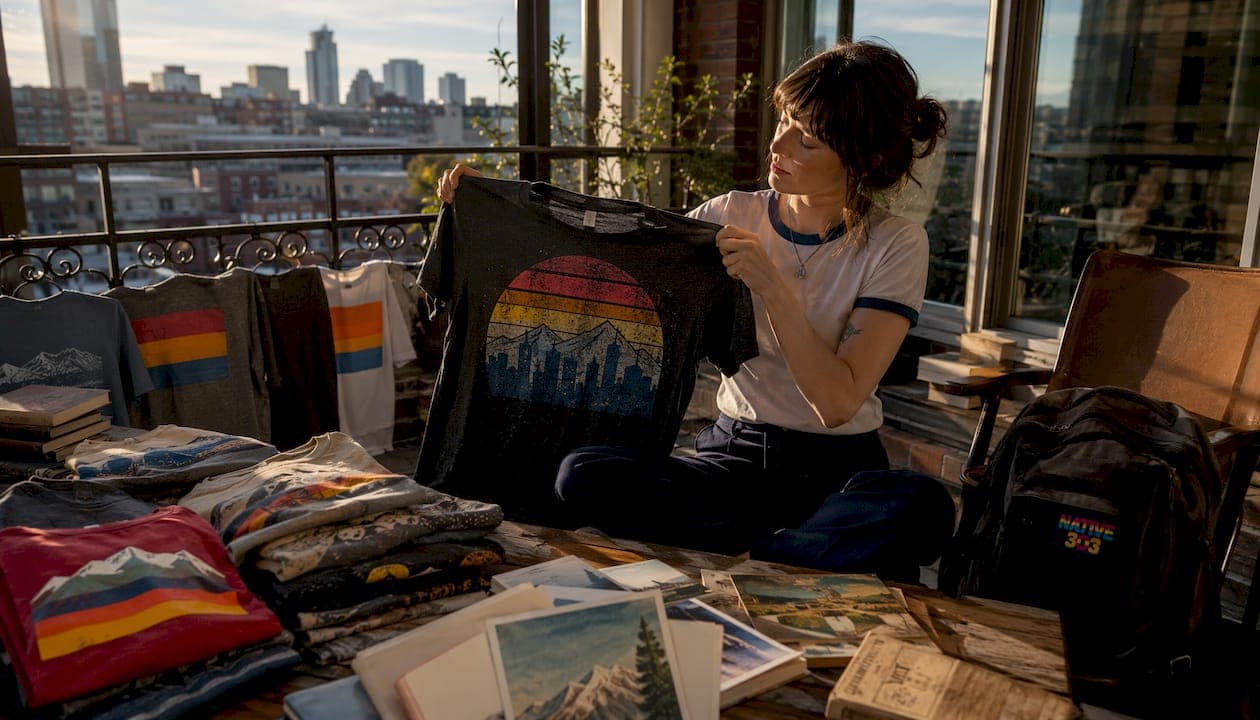
Build a focused Denver nostalgia tee collection by choosing one local theme, locking a cohesive vintage style guide, and validating every design with mockups and at least one production sample before a full run. Native303apparel has done exactly this for Colorado natives aged 35–95, building exclusive designs around the metro Denver venues, diners, and clubs that defined the region's character. One real production constraint to know upfront: specialized vintage techniques like discharge printing and garment-dyeing often carry minimum order quantities of several hundred units, so small-batch planning matters from day one.
TL;DR — your next steps today:
- Pick one narrow Denver/Colorado niche (a single diner, a neighborhood, a music venue era)
- Define a 3–5 color palette and era-appropriate typography rules
- Generate design concepts using consistent AI prompt modifiers, then clean up in a vector editor
- Order digital mockups first, then one physical sample per design
- Plan a launch assortment of between half a dozen and a dozen designs across a focused size run
- Photograph with vintage-friendly lighting and lifestyle props
- Launch with local storytelling copy and a pre-order or limited-drop strategy to validate demand
Table of Contents
- How do you choose the right Denver/Colorado niche for your collection?
- What does a vintage style guide actually look like for a tee collection?
- Which tools and workflow steps help non-designers produce print-ready vintage graphics?
- How do fabric and print method choices affect vintage authenticity?
- How many designs and SKUs should you launch with?
- How should you photograph and merchandise a vintage tee collection online?
- Copyright and licensing considerations for vintage graphics
- Marketing and launch strategy for Denver nostalgia buyers
- Sales channels and distribution for vintage tees
- How do you refine the collection after launch?
- Native303apparel: Denver nostalgia designs you can shop or customize
- Key Takeaways
- Why local specificity beats broad nostalgia every time
- Recommended sources and further reading
How do you choose the right Denver/Colorado niche for your collection?
The most collectible vintage tee collections are built around a single, specific story, not a broad theme. "Colorado nostalgia" is a category. "Denver diners of the 1970s" is a collection. The difference matters because specificity drives perceived rarity, and rarity drives repeat purchases from buyers who want to own the whole set.
Start by asking which local memory your target buyer would recognize immediately. For Colorado natives aged 35–95, that could be a specific Colfax Avenue diner, a Capitol Hill record shop, an Uptown music venue from 1980–1995, or a Five Points jazz club. The Denver retro graphic tee themes that resonate most are the ones tied to a real place and a real era, not a generic mountain silhouette.
Strong niche definitions to model:
- "Denver diners of the 1970s" (specific decade, specific venue type)
- "Uptown music venues, 1980–1995" (neighborhood + era window)
- "Five Points jazz clubs, 1950s–1960s" (cultural district + decade)
- "Colorado ski towns before the resorts" (regional + pre-commercial era)
One practical note: before you build designs around a specific venue name or logo, confirm whether the intellectual property is still active. Most defunct local businesses have no active trademark, but a quick USPTO search takes five minutes and protects you from a cease-and-desist later.
Pro Tip: Talk to people in your target age range before you finalize the niche. The venues that come up most often in conversation, the ones that get a "oh, I used to go there every Friday" reaction, are your strongest design candidates.
What does a vintage style guide actually look like for a tee collection?
Consistency in visual language is what separates a random assortment from a collection that feels curated and intentional. Lock these four elements before you design a single shirt.
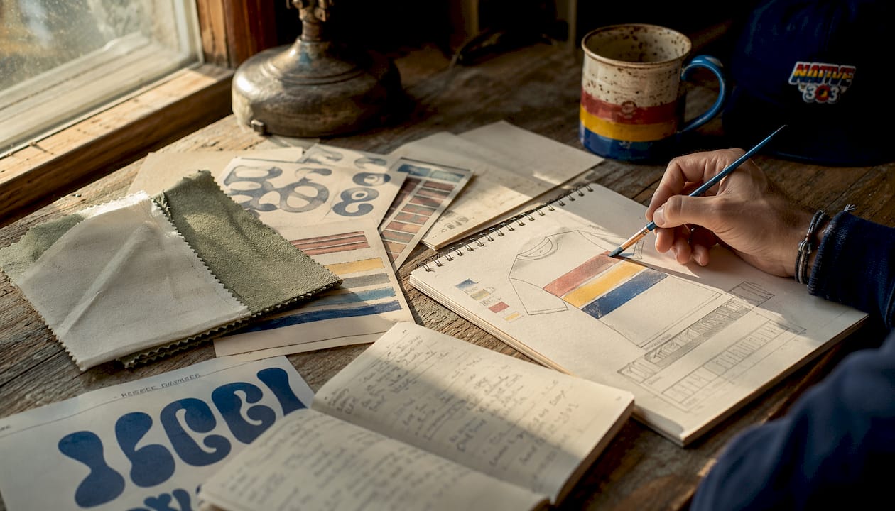
Color palette: Choose 3–5 core colors that evoke the Denver/Colorado era you're referencing, plus one accent. Faded terracotta, dusty sage, warm cream, and brick red read 1970s Colorado without screaming it. Muted navy, burnt orange, and off-white work for 1980s venue graphics. Limit the palette so every shirt in the collection looks like it belongs to the same family.
Typography: Era-appropriate fonts carry more period authenticity than any distressing effect. Slab serifs and condensed gothics read 1960s–1970s diner signage. Brush scripts and inline display fonts read 1980s concert posters. Typography choices in apparel affect how buyers read the era at a glance, so pick two typefaces maximum per collection: one headline, one secondary.
Vintage treatments: The table below shows how common treatments map to production methods.
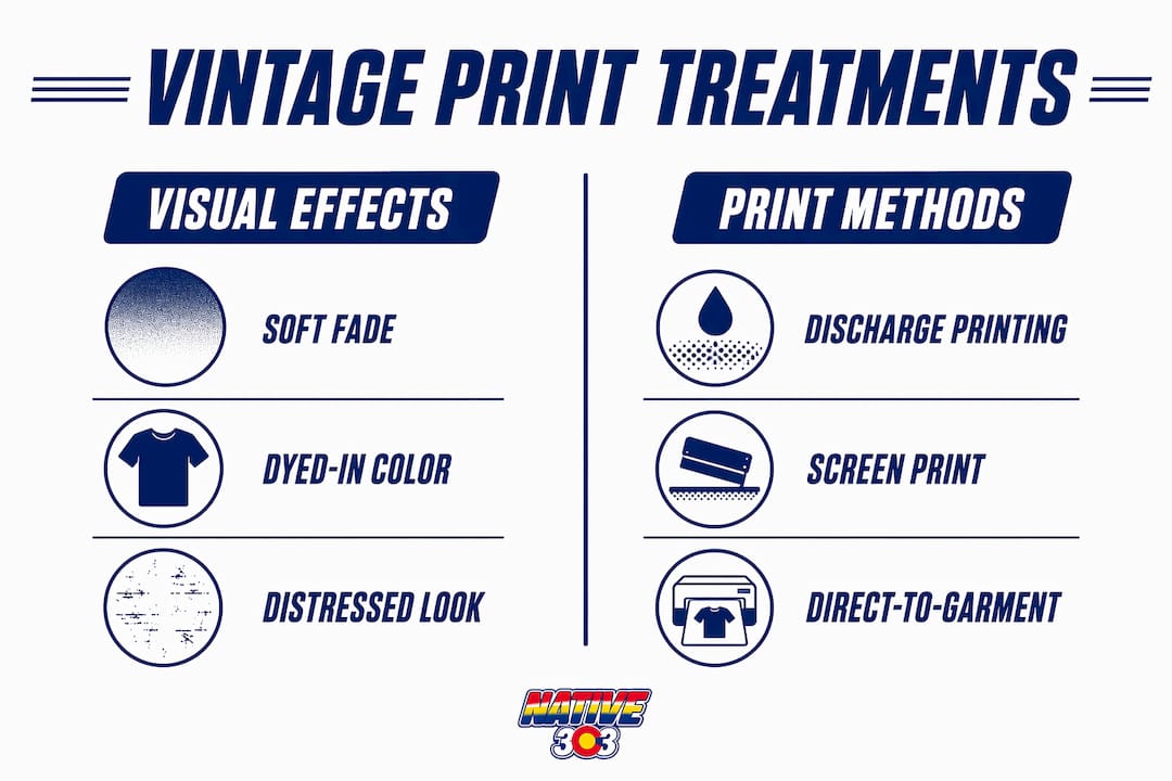
| Treatment | Visual effect | Best print fit | Trade-off |
|---|---|---|---|
| Discharge look | Soft, dyed-in color with no hand feel | Discharge screen print | Higher MOQ, setup cost |
| Garment-dye blended look | Muted, lived-in base with tonal print | DTG on garment-dyed blank | Lower MOQ, less color pop |
| DTG crisp fade | Sharp detail with digital distress overlay | DTG on tri-blend | Fine detail, moderate hand |
| Halftone/duotone | High-contrast, poster-style aged look | Screen print | Best for bold, simple art |
Which tools and workflow steps help non-designers produce print-ready vintage graphics?
A repeatable workflow prevents each design from drifting away from the collection's visual identity. Here is the sequence that works for small-batch Denver nostalgia collections:
- Define the theme brief — one sentence per design: venue name, era, mood, and color constraints.
- Batch AI prompts — use consistent modifiers like "vintage wash," "screen print style," "1970s color palette," "distressed overlay," and "halftone texture" to keep AI-generated outputs coherent across the set.
- Select and edit variants — pick the strongest two or three outputs per design, then clean up in Adobe Illustrator or Affinity Designer to vectorize and separate colors.
- Flatten and prep files — convert to spot colors, flatten layers, and export at 300 DPI minimum for print.
- Mockup on garment — use Canva templates or a dedicated mockup service to validate scale, placement, and contrast on different shirt silhouettes.
- Order one physical sample — digital mockups speed iteration, but a real sample reveals ink hand feel and fit issues that no screen can show.
- Approve and release to production.
Recommended tools by role:
- AI concept generation: Midjourney, Adobe Firefly
- Vector editing: Adobe Illustrator, Affinity Designer
- Mockups: Canva, Placeit, Printful's mockup generator
- Color reference: Adobe Color, Coolors
Pro Tip: Keep a prompt and revision log for every design. When you launch a second drop six months later, that log is the only thing that stops the new designs from drifting off-palette.
How do fabric and print method choices affect vintage authenticity?
Fabric is the first decision, and it affects everything downstream. Tri-blend and poly/cotton blends reproduce the drape and faded base color of authentic vintage tees far better than heavy 100% cotton. Garment-dyed blanks add a tonal, lived-in base that makes even a fresh print look like it has a history.
For print method, discharge printing is the gold standard for soft vintage hand feel. It replaces the shirt dye with the print color rather than sitting on top of the fabric, so the print feels like part of the shirt. DTG on a garment-dyed or heathered blank is the practical alternative for smaller runs, and careful digital distressing on a tri-blend base can convincingly mimic aged clothes without chemical treatments.
| Garment/method | Appearance | Hand feel | Typical MOQ | Notes |
|---|---|---|---|---|
| Tri-blend + DTG | Soft fade, fine detail | Very soft | 1 unit | Best for small-batch testing |
| Garment-dyed + discharge | Rich, muted, dyed-in color | Softest | several hundred units | Highest authenticity, higher cost |
| 100% cotton + screen print | Crisp, bold | Moderate | — | Durable, less vintage drape |
| Heathered cotton + DTG | Subtle texture, muted | Soft | 1 unit | Good middle ground |
Pro Tip: Always request a pre-production sample before committing to a full run. Wash it twice, then check color fidelity, ink hand feel, and fit. What looks right on screen often surprises you in person.
How many designs and SKUs should you launch with?
For a first drop, between half a dozen and a dozen designs is the practical range. Fewer than six and the collection feels thin; more than twelve and you risk slow-moving inventory on designs that haven't been validated yet. A mix of evergreen and limited-edition pieces gives buyers a reason to return: the evergreen designs anchor the brand, the limited drops create urgency.
Size distribution for a buyer demographic of adults in mid to older age groups should weight toward medium through extra-large, with fewer small and 2XL sizes recommended.
Key assortment decisions:
- Limit colorways to one or two per design at launch; more options dilute the collectible feel
- Set a reorder trigger at 30% remaining inventory so you're not scrambling when a design sells through
- Use pre-orders or a limited drop to validate demand before committing to a full production run
Pro Tip: A pre-order for 20–30 units on a new design costs you nothing and tells you exactly which concepts your buyers actually want before you spend on production.
How should you photograph and merchandise a vintage tee collection online?
Lifestyle photography that echoes local memories increases perceived authenticity. A Denver diner tee shot on a model in a vintage diner booth, paired with retro denim and a period-appropriate prop, tells the story without a caption.
Your shot list for each design:
- Hero flat-lay on a textured surface (worn wood, concrete, aged paper)
- On-body lifestyle shot in a location that matches the niche era
- Close-up of the print surface to show ink texture and fabric drape
- Size guide reference shot showing fit across two body types
Styling notes: muted, warm lighting preserves the vintage palette better than bright studio flash. Overexposed whites blow out the faded tones that make the shirt look authentic. For styling vintage-inspired tees in a modern context, pair with straight-leg denim, work jackets, or canvas sneakers to keep the era feel without looking like a costume.
Copyright and licensing considerations for vintage graphics
Most defunct Denver venues have no active trademark, but "defunct" does not automatically mean "free to use." A business that closed in 1985 may have heirs, estate holders, or a successor company that retained IP rights. Before using a specific logo, signage, or name, run a USPTO trademark search and, when in doubt, consult an IP attorney.
Original artwork inspired by a venue's era, color palette, and general aesthetic is generally safer than reproducing an actual logo. Designs that evoke "a 1970s Denver diner" rather than copying a specific sign sidestep most infringement risk. Historic photographs used as reference are fine; reproducing them on a shirt requires permission from the copyright holder, which is often a local archive or newspaper.
Marketing and launch strategy for Denver nostalgia buyers
Colorado natives aged 35–95 respond to specificity and memory, not generic vintage aesthetics. Your marketing copy should name the place, the era, and the feeling. "The shirt your dad wore to Duffy's Shamrock" lands harder than "vintage Denver tee."
Channels that work for this audience: local Facebook groups tied to Denver neighborhoods, Instagram accounts focused on Colorado history, and partnerships with local history organizations or museums. Email is underrated here. Buyers who remember these venues are often more engaged with longer-form storytelling than younger demographics.
For launch, a community-inspired clothing approach builds pre-launch buzz: share the design process, ask followers which venue they remember most, and let the community vote on the next drop.
Sales channels and distribution for vintage tees
Direct-to-consumer via your own e-commerce storefront gives you the most control over brand presentation and customer data. For a hyperlocal Denver nostalgia brand, that's the right primary channel. Marketplaces dilute the story and commoditize the product.
Secondary channels worth considering: local pop-up markets (Denver's RiNo and South Broadway neighborhoods draw exactly the right demographic), consignment with local vintage shops, and wholesale to Denver-area gift shops and museum stores. Each channel should reinforce the local story, not just move units.
How do you refine the collection after launch?
Post-launch feedback is the most reliable design brief you'll ever get. Track which designs sell through fastest, which sizes run out first, and which colorways sit. That data tells you more than any focus group.
Collect qualitative feedback through post-purchase email surveys (one or two questions maximum) and social comments. Buyers who grew up near a specific venue will tell you exactly what you got right and what you missed. Use that to brief the next drop, adjust the size curve, and retire designs that don't connect.
Native303apparel: Denver nostalgia designs you can shop or customize
Native303apparel is the direct answer for collectors who want exclusive Denver and Colorado nostalgia designs without building a production pipeline from scratch. The collection covers historic metro Denver eateries, clubs, shops, and landmarks across t-shirts, sweatshirts, hoodies, jackets, tote bags, hats, and pint glasses, all built around the bold red, yellow, and blue Colorado palette with a retro-Americana sensibility.
If you have a specific venue, era, or design in mind that isn't in the current collection, Native303apparel accepts custom requests for specific designs, colors, and sizes. Check the size guide before ordering to get the fit right, then shop the full collection to find the Denver story that belongs in your wardrobe.
Key Takeaways
A focused Denver/Colorado niche, a locked visual style guide, and at least one pre-production sample are the three non-negotiable steps before any production run.
| Point | Details |
|---|---|
| Narrow the niche | Pick one venue, neighborhood, or era — specificity drives collectibility and repeat purchases. |
| Lock the style guide | Limit to 3–5 colors and two typefaces before designing a single shirt. |
| Validate with samples | Order one physical sample per design and wash-test it before committing to a full run. |
| Plan the assortment | Launch with between half a dozen and a dozen designs; weight sizes toward M–XL for a 35–95 adult demographic. |
| Native303apparel | Shop or request custom Denver nostalgia designs at Native303apparel; check the size guide first. |
Why local specificity beats broad nostalgia every time
The conventional wisdom in vintage apparel is to cast wide: more references, more eras, more people who might recognize something. That logic works for mass-market retailers. It kills a hyperlocal collection.
What actually makes a Denver nostalgia tee worth owning is the moment a buyer sees it and thinks "I was there." That reaction only happens when the design is specific enough to trigger a real memory, not just a general warm feeling about the past. A shirt that says "Denver, 1970s" is a souvenir. A shirt that captures the exact color and typography of a specific Colfax diner sign is a piece of personal history.
The brands that build lasting collector followings, the ones where buyers come back for every drop, are the ones that do the curatorial work. They dig into local archives, talk to people who were there, and translate specific memories into designs that feel earned. That's the gap between a random assortment and a collection people actually want to complete.
Native303apparel's approach, exclusive designs tied to real Denver and Colorado venues and eras, is exactly that kind of curation. The worn graphics and craft choices that go into each design reflect a specific place and time, not a generic aesthetic trend.
Recommended sources and further reading
- How to Build a Complete T-Shirt Collection Using AI Prompts — OrangeBox
- The Vintage Print T-Shirt: A Sourcing Guide — FEXWEAR
- 3 Easy Steps for Creating Vintage T-Shirts — RealThread
- Custom Vintage T-Shirts: Ultimate Guide for Sellers — PODPartner
- How to Make Vintage T-Shirts — Printful
- Vintage T-Shirt Templates — Canva
- Native303apparel Size Guide
- About Native303apparel
- Native303apparel Store