
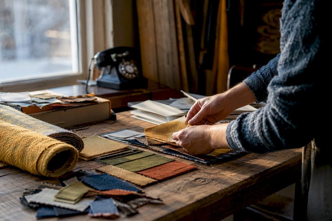
Throwback design elements are the specific colors, type styles, patterns, textures, and shapes that signal a particular decade to a viewer at a glance. They work because they trigger recognition before analysis. You see mustard yellow and rounded chrome and your brain says "1970s" before you've consciously registered a single detail.
The fastest way to spot them:
- Color palettes tied to a specific decade's dominant hues
- Typography with era-specific letterforms and proportions
- Patterns and motifs like checkerboards, Memphis squiggles, or halftone dots
- Textures and finishes such as chrome, lacquer, shag, or grain
- Shapes and composition like starbursts, sunbursts, and bold silhouettes
- Imagery treatments including halftone photography and flat illustration
- Objects and product details like starburst clocks or tufted upholstery
What follows breaks down each category by decade, with practical notes on how to use them without turning your design into a costume.
Key Takeaways
Throwback design works when a small set of era-specific cues, color, type, pattern, and one anchor object, are paired with modern constraints on contrast and layout.
| Point | Details |
|---|---|
| Color signals era fastest | Choose one decade's signature palette rather than blending hues from multiple eras. |
| Pick one anchor element | Build the rest of the design around a single object, pattern, or font for coherence. |
| Match audience to decade | Use the 20-year nostalgia cycle to pick an era tied to your audience's own childhood touchpoints. |
| Modern constraints protect usability | Keep contrast, accessibility, and responsive behavior current even when the visual style is retro. |
| Texture should look intentional | Apply grain, wear, and distressing unevenly so it reads as authentic rather than accidental. |
Table of Contents
- Color Palettes That Instantly Signal a Decade
- Typography That Reads as Retro at a Glance
- Patterns and Motifs That Signal a Specific Decade
- Textures and Materials That Suggest Age
- Shapes, Lines, and Composition That Read as Retro
- Photography and Illustration Styles That Signal Nostalgia
- Objects and Product Details That Anchor an Era
- How to Choose a Throwback Decade and Apply It Well
- Decade Cheat Sheet: Quick Visual Shorthand
- Why Retro Works: The Theory Behind the Trend
- Sources
Color Palettes That Instantly Signal a Decade
Color is the fastest era recognizer in design, faster than typography, faster than pattern. Your eye reads hue and saturation before it processes any other visual information, which is why a single swatch of avocado green does more nostalgic heavy lifting than an entire paragraph of period-accurate copy. Pinterest's trend data recorded a 145% jump in searches for certain vintage palettes, a sign that audiences are actively hunting for these specific color combinations rather than just responding to them passively.
Each decade has a signature combination worth knowing cold.
| Era | Signature Palette | Usage Note |
|---|---|---|
| 1950s midcentury | Mustard yellow, avocado green, dusty turquoise | Pairs best with clean whites for a diner or kitchen feel |
| 1970s | Burnt orange, harvest gold, warm browns | Works well with wood tones and earthy textures |
| 1980s Memphis/neon | Electric pink, cyan, black accents | Needs high contrast to avoid looking muddy |
| 1990s tech nostalgia | Teal, purple, silver | Pairs with geometric shapes for a Y2K feel |
Pro Tip: Modern screens can wash out low-contrast retro palettes. You can keep the era cue without sacrificing readability.
Typography That Reads as Retro at a Glance
Type carries almost as much era information as color, and it's often the detail that separates a convincing throwback design from a costume-party version. Each decade produced typefaces with distinct proportions, weights, and quirks that a trained eye picks up instantly.
- Art Deco display faces: tall, geometric, often with sharp angles and gold-foil energy (1920s to 1930s)
- Midcentury sans serifs: rounded terminals, moderate weight, optimistic and clean (1950s to 1960s)
- Groovy display type: bulging letterforms, psychedelic curves, hand-lettered feel (1970s)
- Pixel and techno fonts: blocky, low-resolution, monospaced rhythm (1980s to 1990s)
Look for character cues like exaggerated x-heights, unusual ligatures, or letters that lean into their era's printing limitations. When pairing a retro display font with body copy, keep the body text in a clean, modern sans or serif. That contrast lets the display font do the nostalgic work while the reader can still comfortably scan a paragraph.
Patterns and Motifs That Signal a Specific Decade
Repeating graphics do a lot of the era-signaling work that color and type start. A practical retro design taxonomy points to shapes, lines, textures, and fonts as the core toolkit, and patterns sit right at the intersection of shape and texture.
- Checkerboard: 1950s diner culture and 1980s skate/punk revival
- Memphis squiggles and confetti shapes: 1980s postmodern design
- Halftone dots: mid-20th-century print and comic book aesthetics
- Paisley and floral swirls: 1960s and 1970s counterculture
- Hexagon and Moroccan tile patterns: 1970s interiors
Scale matters more than most designers realize. A small, tight repeat feels vintage and printed, almost like old wallpaper or fabric. Blow that same pattern up to a large, isolated motif and it reads as a bold modern graphic making a retro reference rather than an actual period piece. Mixing patterns from different decades in one design usually creates visual noise. Pick one pattern family and let it carry the section.
Textures and Materials That Suggest Age
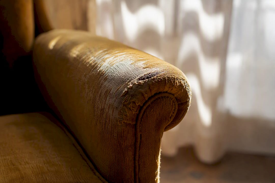
Tactile cues tell your eye a design has history, even when the design is brand new. Film grain, paper inconsistency, and simulated wear are the digital shortcuts designers use to fake decades of aging in an afternoon.
- Film grain and print noise for a mid-century photographic feel
- Halftone printing texture for comic and pulp aesthetics
- Chrome and lacquer finishes for 1950s and 1980s product design
- Plush textures like velvet and shag for 1970s interior warmth
- Edge wear and ink bleed for a hand-printed, well-worn look
Simulating these effects digitally works best with restraint. Grain and print inconsistency can be layered onto flat digital art to suggest analog production without needing an actual scanner or darkroom.
Pro Tip: Apply distressing unevenly, not as a uniform filter over the whole image. Real wear happens at edges, corners, and high-touch areas first. A uniformly scuffed design looks like a preset. An unevenly worn one looks lived in.
Shapes, Lines, and Composition That Read as Retro
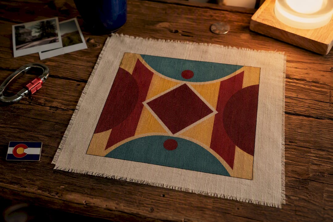
Geometry carries just as much era information as color or type, sometimes more, because it shapes how a layout feels before anyone reads a word.
- Starbursts and sunbursts for 1950s and 1960s optimism
- Circular frames and portholes for midcentury product design
- Diamonds and chevrons for 1970s and 1980s pattern work
- Bold, rounded silhouettes for midcentury furniture and appliance shapes
Line treatment shifts the tone even more than the shapes themselves. Thick outlines feel playful and cartoonish. Inset lines within a shape suggest chrome trim or engraving. Radiating lines from a central point read as energy, motion, or a burst of light, which is why they show up constantly in 1950s advertising.
To test whether a layout genuinely reads retro, ask whether it relies on symmetry, centered focal points, and geometric repetition. Modern layouts lean asymmetric and grid-broken. Retro layouts tend to center everything and let a bold shape anchor the composition.
Photography and Illustration Styles That Signal Nostalgia
Visual treatment, not just subject matter, is what pushes an image into throwback territory. Halftone photography, with its visible dot pattern, instantly recalls mid-20th-century print. Desaturated or warm-tinted color casts suggest faded film. Flat, two-color illustration styles borrow directly from 1960s and 1970s advertising art, while collage and screen-print effects echo punk zine culture and 1980s DIY design.
- Halftone dots for a print-era photographic look
- Warm or faded color grading for a "found photo" feel
- Flat illustration with limited color palettes for advertising-era charm
- Collage and torn-paper effects for a punk or zine aesthetic
Photography tends to feel more emotionally direct and personal. Illustration reads as more stylized and brand-forward. Choose photography when you want authenticity and warmth, illustration when you want control over color and mood.
Pro Tip: Genuine vintage photography often carries licensing restrictions even when it looks old enough to be public domain. Verify usage rights before building a campaign around a found image, or commission an illustrator to recreate the look instead.

Objects and Product Details That Anchor an Era
Physical objects carry era information the same way colors and fonts do, and they translate surprisingly well into apparel and merchandise design. Starburst clocks, sculptural lamps, and chrome trim all signal specific decades the moment they appear in an image or a graphic. The evolution of neon signage shows how commercial fixtures shifted decade to decade, and those signage shapes remain shorthand for a past era of storefronts and diners.
- Starburst clocks and atomic-age lamps for midcentury references
- Chrome trim and tufted upholstery for 1950s and 1980s diner culture
- Colored kitchen appliances (avocado green, harvest gold) for 1970s domestic nostalgia
- Small product details like woven labels, contrast stitching, or metal zippers add authenticity to apparel
These small details matter more than most people expect. A woven label or a specific stitch pattern on a garment can do as much era-signaling as the print on the front.
How to Choose a Throwback Decade and Apply It Well
Pick a decade before you pick anything else. Everything downstream depends on that first choice.
- Choose your decade based on your audience's cultural touchpoints, not just personal taste.
- Select 2 to 3 anchor elements (one palette, one pattern, one shape language) rather than trying to use everything from that era at once.
- Set modern constraints around contrast, accessibility, and responsive behavior so the design still functions on a phone screen.
- Test the result against a genuinely modern layout to confirm the retro cues read as intentional, not accidental.
Designers who specialize in retro interiors and apparel consistently recommend picking one anchor piece, a wallpaper, a light fixture, a single bold graphic, and building the rest of the design around it rather than recreating an entire era wholesale.
- Do limit your palette to two or three era-accurate colors
- Do mix one retro anchor with otherwise contemporary layout and type
- Don't combine motifs from three different decades in one piece
- Don't sacrifice legibility or accessibility for the sake of authenticity
If you're translating these choices into apparel or merch, styling vintage-inspired tees alongside modern basics is a useful reference for how restraint plays out in a finished product.
Decade Cheat Sheet: Quick Visual Shorthand
- 1950s: Mustard, turquoise, chrome trim. Rounded sans type. Starburst motifs. Diner and atomic-age objects.
- 1960s: Bold primary colors, paisley, groovy hand-lettering, mod circular shapes.
- 1970s: Earth tones, harvest gold, rounded groovy type, hexagon and Moroccan patterns, shag textures.
- 1980s: Neon pink and cyan, Memphis squiggles, pixel-adjacent fonts, chrome and geometric shapes.
- 1990s/Y2K: Teal and purple, holographic finishes, techno fonts, minimal flat illustration.
A quick application example: for a 1970s-inspired tee graphic, pair a harvest gold background with a single rounded groovy typeface and one hexagon border pattern. Skip the shag texture entirely since it doesn't translate to print. For deeper decade context, an overview of iconic fashion trends across the 1920s, 1960s, and 2000s is a useful companion reference.
Why Retro Works: The Theory Behind the Trend
Nostalgia in design isn't random. It follows a predictable pattern that's worth understanding if you want your throwback choices to land with the right audience.
- The 20-year nostalgia cycle suggests each generation rediscovers the aesthetics of roughly 20 years prior as fresh and reinterpretable, rather than dated.
- Designers can map a target audience's childhood decade to choose era cues that will resonate emotionally rather than feel like costume.
- Retro design functions as cultural sampling: designers pull emotionally resonant visual fragments from the past to build new narratives, not historically accurate reproductions.
Retro borrowing works because designers isolate the most emotionally compelling fragments of a past era rather than reconstructing it faithfully, relying on resonance over accuracy to make the design feel authentic to a viewer.
This idea comes from research on historical distance and cultural sampling, and it explains why a single starburst clock or one Memphis pattern can carry an entire design's nostalgic weight without needing period-perfect accuracy everywhere else. For further reading on how these cycles shape audience response, Dr. Lauren Downing Peters' research on generational fashion cycles is worth a look.
Applying throwback elements at Native303apparel
I generally start with one object. Maybe it's a neon sign shape or a specific typeface from a Denver storefront that closed decades ago. Everything else, the palette, the texture, the layout, gets built as modern support around that single anchor. Our approach to era-specific graphics in apparel follows that same logic: one strong nostalgic reference, framed by contemporary design so it never feels like a costume.
Sources
- Retro Design Elements: How Nostalgia Drives Modern Engagement
- Introduction to retro design: chip off the old block | Graphic design tips
- What Is Retro Design? Explore Its History and Key Elements
- But you weren’t there: Effects of historical distance and cultural sampling on taste