

A vintage font style is any typeface that borrows letterforms and production quirks from a specific historical era, chosen to trigger that era's mood the second someone sees it. Before you touch a project, run through this checklist:
- Serif shape: bracketed and soft (older), or thin and hairline (Victorian-era Didone)
- Stroke contrast: low contrast reads earlier, high contrast reads 1800s
- Terminals: ball, wedge, or blunt cuts signal different decades
- Ornamentation: swashes, drop shadows, and inline strokes push a face toward "costume" territory fast
Monotype's type classification guide organizes these categories the way most working type designers already think about them, and Native303apparel builds a lot of its Denver-nostalgia apparel work around exactly this framework.
Key Takeaways
Choosing a vintage font style comes down to matching serif shape, contrast, and terminals to a specific era, then pairing that display face with a neutral body type for legibility.
| Point | Details |
|---|---|
| Start with era, not font | Pick the decade or mood first, then shortlist display faces that match it. |
| Learn the four serif groups | Humanist/Garalde, Transitional, and Didone each carry a different contrast level and mood. |
| Reserve ornament for display | Scripts, blackletter, and incised faces belong in headlines and logos, never body copy. |
| Pair for contrast, not chaos | Match x-height between display and body fonts and cap it at two families. |
| Test at production scale | Proof fonts on the real material, screen, print, or fabric, before finalizing a design. |
Table of Contents
- What Does "Vintage" Actually Mean in Typography?
- What Are the Major Vintage Font Categories?
- How Do You Choose and Pair Vintage Fonts for a Project?
- Where Can You Find and License Vintage Fonts?
- A Working Designer's Take on Vintage Type for Apparel
- Frequently Asked Questions
- Sources
What Does "Vintage" Actually Mean in Typography?
"Vintage" isn't a font category, it's a reference point. A typeface earns the label when it echoes an era's production method, whether that's the pointed-nib calligraphy behind mid-century scripts, the engraving tools behind Didone serifs, or the hand-cut wood type behind old advertising slabs. A vintage font emulates the design aesthetics of a specific historical period, often carrying decorative flourishes and smaller character sets than a modern typeface would ship with, according to WordSCR's breakdown of vintage typography.
Designers reach for these styles for reasons that have nothing to do with nostalgia for its own sake:
- Instant authority or warmth: an old serif reads as established; a script reads as personal
- Differentiation: everyone's brand looks like a geometric sans right now, so an old-style face stands out by default
- Storytelling: a font that matches the decade of the eatery or venue you're referencing does half the branding work for you
- Era signaling on merch: packaging and apparel benefit from a single glance telling the customer "this is a callback"
Monotype's guide and the ATypI classification standard both group typefaces this way for a reason: once you know the category, you know the decade, and once you know the decade, pairing gets a lot easier.
What Are the Major Vintage Font Categories?
This is the part that actually saves you time on a deadline. Each category below has its own visual fingerprint, its own classic examples, and its own lane in a design.
Serif families: Humanist, Garalde, Transitional, Didone
The oldest branch of vintage typography splits into four recognizable groups, and the split comes down almost entirely to stroke contrast and serif shape.
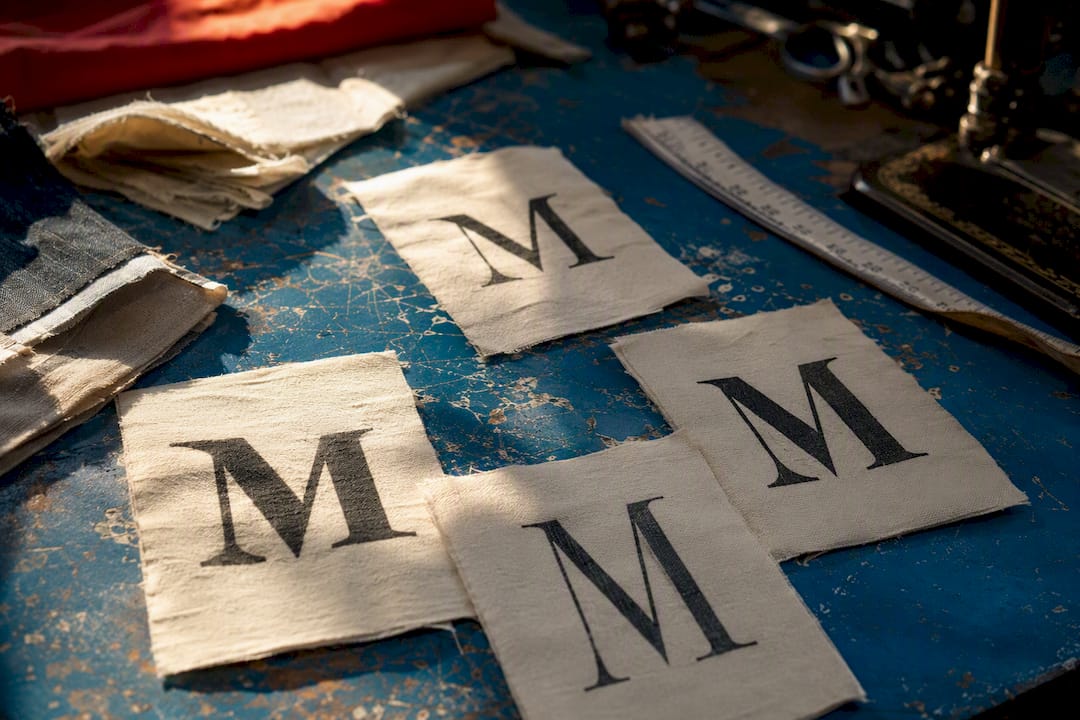
Humanist and Garalde faces (Garamond is the textbook example) have low contrast, angled stress, and bracketed serifs that look hand-drawn because they basically were. These read as literary, warm, and trustworthy. Use them for book interiors, editorial layouts, or any apparel graphic that wants to feel like an old menu rather than a modern label.
Transitional serifs (Baskerville) tighten up the contrast and straighten the stress axis, sitting halfway between old-style warmth and modern precision. Baskerville shows up constantly in upscale packaging because it reads refined without reading cold.
Didone faces (Bodoni, Didot) push contrast to the extreme: hairline serifs, near-vertical stress, dramatic thick-thin strokes. These scream Victorian fashion plates and 1970s disco branding in equal measure, depending on how you weight them. Great for display and editorial headlines, rough for body copy at small sizes.
Times sits in its own bucket, a Transitional workhorse built for newsroom legibility rather than flair, which is exactly why it still reads as "official document" a century later.
Slab serifs
Slab serifs (think Clarendon-style faces) trade bracketed serifs for square, blocky ones with minimal contrast. They were built for 19th-century advertising posters that needed to punch through from across a street, and that DNA still shows. Use slabs for headline type on apparel graphics, retail signage callbacks, and anywhere you want "old advertising" without going full ornament.
Sans serif subtypes
Sans faces aren't inherently modern. Some of the most recognizable "vintage" sans styles are:
- Grotesque (Franklin Gothic): irregular, slightly awkward curves, heavy presence, reads industrial and early 1900s
- Neo-grotesque (Helvetica): cleaned-up grotesque, tighter and more neutral, mid-century in feeling despite looking timeless
- Geometric: built from circles and straight lines, Bauhaus-era energy
- Humanist (Gill Sans): sans letterforms with proportions borrowed from old-style serifs, warmer than a grotesque and popular on mid-century British packaging
Franklin Gothic and Helvetica both carry enough era weight to anchor a headline on their own; save the geometric and humanist sans options for body copy where you need legibility more than personality.
Scripts, blackletter, and incised display faces
Scripts pull from handwriting and brush lettering and instantly signal mid-century Americana, the exact register that works on diner-style apparel graphics and soda-shop branding. Blackletter (Textura-style forms) reads medieval-to-Gothic and works almost exclusively as display type, never body copy. Incised or glyphic faces like Trajan copy Roman stone-carved letterforms, chiseled terminals and all, and read as authority or prestige on movie posters and monument-style branding. Knockout, a condensed grotesque family built for boxing posters and sports graphics, belongs in this display bucket too: bold, compressed, made to be shouted rather than read quietly.
Refont's guide to retro typography points out that texture and imperfect strokes are what actually sell the retro effect, more than the base letterform shape alone. Ornamentation and era-authentic color choices amplify a font's vintage signal, but only when the texture matches the decade you're referencing.
Pro Tip: Before locking a display face, print it at the actual scale it'll appear on the finished product. A script that looks charming at 72pt on your monitor can turn into an unreadable smear at 2 inches on a tote bag.
How Do You Choose and Pair Vintage Fonts for a Project?
The simplest reliable method: pick the era or mood first, choose one vintage hero font for display, pair it with a neutral and legible body companion, then test everything at final production scale.
- Define the era or mood you're chasing. "1950s diner" and "1920s speakeasy" call for completely different serif contrast and ornament levels.
- Shortlist two or three display candidates that match that mood, not ten. Decision fatigue kills projects.
- Choose a body companion with a simple structure and generous x-height, so paragraphs stay readable once the decorative headline has done its job.
- Check contrast and readability at target size, especially on textured or colored backgrounds where thin strokes disappear.
- License and test on real mockups before final production, not just on screen.
WhatFontIs's guide to vintage pairing backs this exact order: pick the era, then the font, then the pairing, because starting with legibility constraints rules out a lot of tempting ornamental faces before you waste time on them.
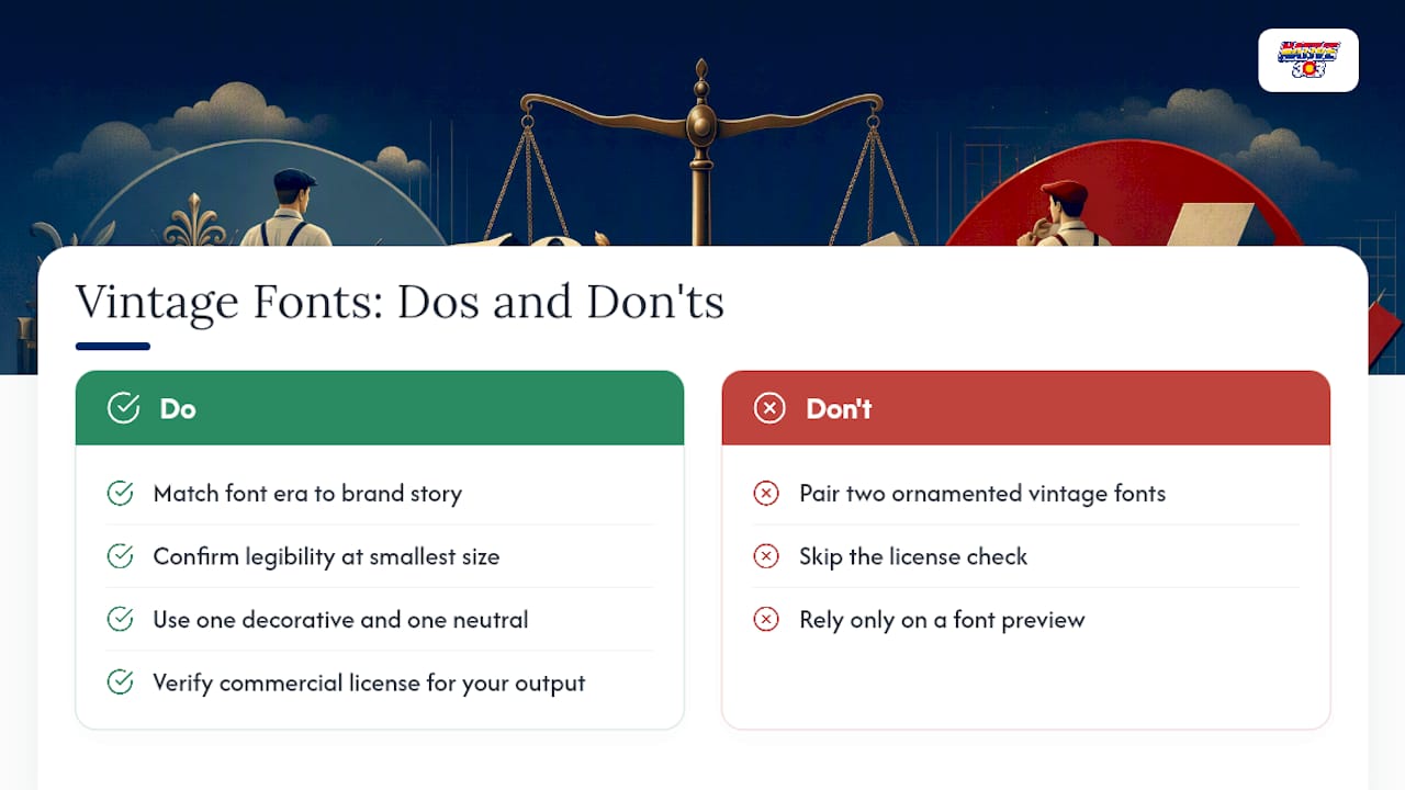
A few pairing rules worth keeping on a sticky note: match x-height between your display and body fonts so they don't look like they're arguing with each other, keep the palette to two type families maximum, and let one face carry the ornamentation while the other stays quiet. Common mistakes to watch for include stacking two heavily decorated fonts together, choosing a Didone for long paragraphs, and mixing letterforms from two different eras so the whole piece reads like a costume rather than a considered design.
Pro Tip: Pro designers routinely reserve vintage type for headlines and logos, then pair it with a clean, modern, neutral sans-serif for body copy. That modern grounding keeps a design feeling intentional rather than dated.
Where Can You Find and License Vintage Fonts?
Google Fonts covers plenty of web-friendly vintage revivals at no cost, Adobe Fonts bundles broader access through a subscription, and independent foundry marketplaces carry the more distinctive display and novelty faces you won't find bundled anywhere else.
Before you commit to a face, run this checklist:
- Confirm commercial vs. personal use terms, since apparel and merchandise almost always require a commercial license
- Check whether the license covers desktop use, webfonts, or app embedding separately
- Look for redistribution restrictions, especially if you're handing off print-ready files to a manufacturer
- Review the glyph set: diacritics, numerals, and alternate characters vary wildly between vintage revivals
- Verify the face includes decorative features like swashes, ligatures, or inline strokes if your design depends on them, per Refont's notes on retro font features
Pro Tip: Always proof a vintage font on the actual output material, whether that's a screen mockup, a letterpress plate, or a printed garment. Fabric texture and wash cycles can blur fine serifs that looked crisp in a digital preview.
A Working Designer's Take on Vintage Type for Apparel
Vintage typography only works on apparel when it's tied to a real place or story, not dropped in because it looks cool. At Native303apparel, the fonts get chosen after the story does. A shirt referencing a long-gone Denver diner needs a script or slab that actually matches that venue's era, not whatever vintage face is trending. That approach shaped how we built out a graphic tee collection around Denver nostalgia and how we think about worn graphics and street style as a design language.
The most useful habit: print your type on actual fabric swatches before finalizing anything. A serif that reads crisp on a monitor can go muddy after a single wash cycle, and you want to know that before a hundred shirts ship, not after.
If you're leaning toward a more polished, tailored vintage look rather than streetwear grit, this guide to refined vintage menswear is worth a look for how that end of the spectrum handles restraint.
Frequently Asked Questions
What are vintage fonts, exactly? A vintage font is any typeface built or revived to emulate the letterforms and production details of a past era, chosen specifically for the mood that era carries.
How do I choose the right vintage font style for a logo? Match the font's era to your brand's story first, then confirm it reads clearly at the smallest size your logo will ever appear, whether that's a favicon or an embroidered patch.
Can I mix two vintage font styles in one design? You can, but stick to one decorative display face and one neutral companion. Two ornamented vintage fonts together usually reads as costume rather than considered design.
Are vintage fonts free to use commercially? Some are, many aren't. Always confirm the license covers commercial use and your specific output, whether that's print, web, or apparel, before production.
What's the difference between a slab serif and a Didone serif? Slab serifs are blocky and low contrast, built for advertising posters. Didone serifs are hairline thin with dramatic thick-thin contrast, built for elegant Victorian-era display type.
Ready to see vintage typography applied to real apparel instead of just a font preview? Browse Native303apparel's current collection for Denver-nostalgia designs built around exactly these type principles, or check the size guide before you order.
Sources
- Guide to type styles | Monotype
- Retro Style Font: Ultimate Guide to Vintage Typography
- How to choose the best fonts to create a vintage style - WhatFontIs Blog
- What Is A Vintage Font? A Timeless Guide | WordSCR